Welcome to the FIRST Passage “What’s New” post!
This regular update will be your guide to the big updates on the Passage Ticketing platform every month. Here we go!
1. Brand New Customer-Facing Design
This one has been a long time coming, but it’s finally launching TONIGHT! After midnight you’ll see some big changes to the front-end (customer-facing) design on Passage and our category-specific portals. Below are a few highlights!
Brand new, beautiful, event-focused home page.
You might even see a banner image from an event you put on!
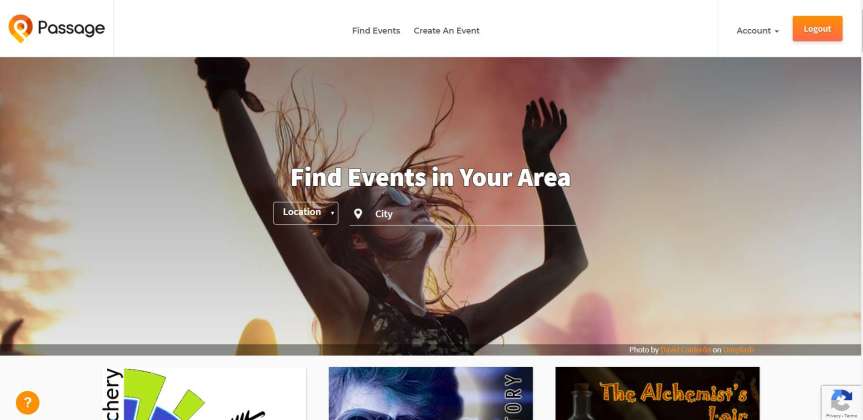
Hey, that could be your event.
Default light-themed event pages (only on Passage portal), with optional “dark mode” for night-life events.
A lot of events we work with have asked for a lighter, more family or business-friendly feel. That’s now the default!
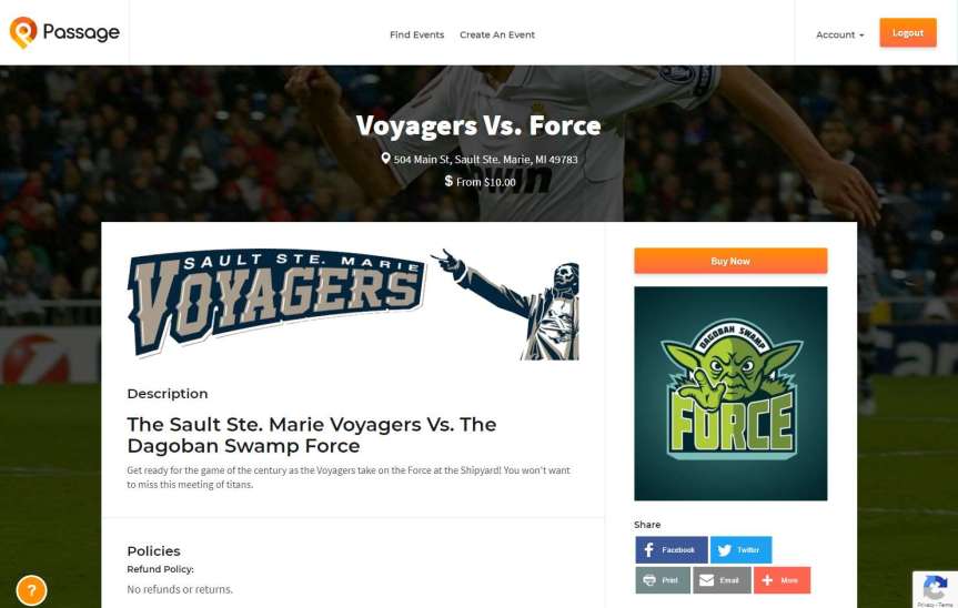
Crisp, light, and super professional, but still with plenty of room to show off your event.
And while the new light theme is beautiful, you can still check “Use Dark Theme on Event Pages” under “Look & Feel” in your event setup if you prefer something a little more exciting.
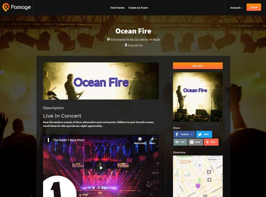
For some events, you still need to rock out.
Tons of room to showcase your event details with images, videos, and more.
One other thing you’ll notice above is how much room we’ve left you to show off your event! Embed banners, links, images, and even full videos to get your fans excited.
But it’s still super easy (even easier) for your fans to buy tickets, packages, or even merchandise that you’ve made available.
When they’re ready, your customers can simply tap “Buy Now” to grab tickets, merchandise, and whatever else you have available for sale.
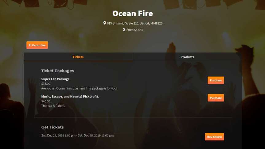
One place to find it all.
Beautiful venue/organization pages to showcase ALL of your great events.
Do you have regular events and hate linking to them all individually? Our previous venue pages were a bit drab. Now they’re beautiful and ready to show off everything you’ve got!
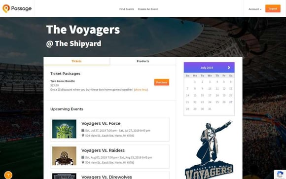
Show it ALL off.
Way more mobile and embed-friendly with the new “floating” buttons and cart.
Over 68% of ticket purchasers on Passage events buy from their mobile devices. This wasn’t hard before, but it’s even easier now and will be more cross-browser compatible. The “Buy Now” buttons and “Cart” always float at the top or bottom of the screen, whether you’re on a desktop, mobile, or checking out from an embedded version. Your fans will love it!
That logo is a little different too 🙂
It’s about time, right?
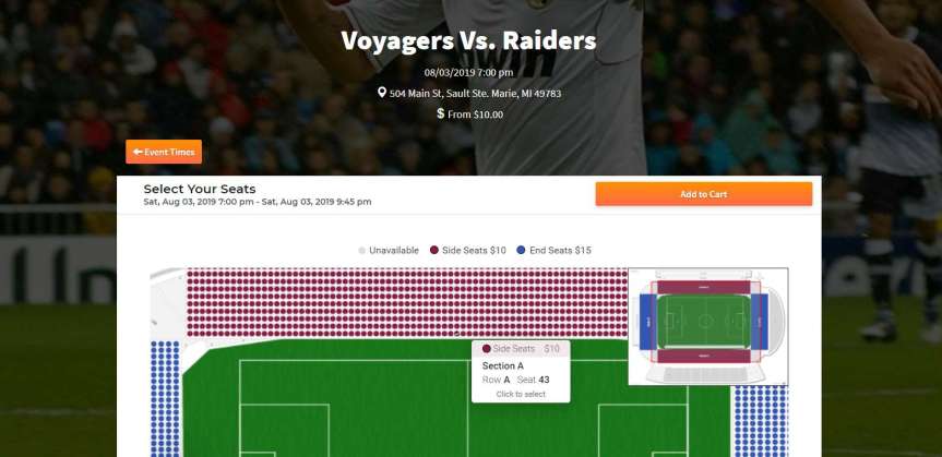
2. Assigned Seating
We’ve been working with more and more soccer teams (and other sports), music venues, and even special dining events. One thing we’ve noticed: a lot of these events could benefit from allowing fans to pick their seats!
3. No More CAPTCHA Puzzles
If you’re tired of trying to figure out which picture contains a fire hydrant, we’ve got you covered. We now have ZERO CAPTCHA puzzles (and have even better protection against bots and spammers!).
All in, those are quite a few changes over the last few weeks, and there are even more to come! In February you’ll see similar design changes to our marketing website, even
We hope you enjoy all of these updates, and as always: hit us up at support@gopassage.com if you have any suggestions or if we can ever be of any help in making your next event a success!

